 AutoForm
Customization
The customization of the components is done by providing a `fieldConfig` to your schema fields. This allows you to customize the rendering of the field, add additional props, and more.
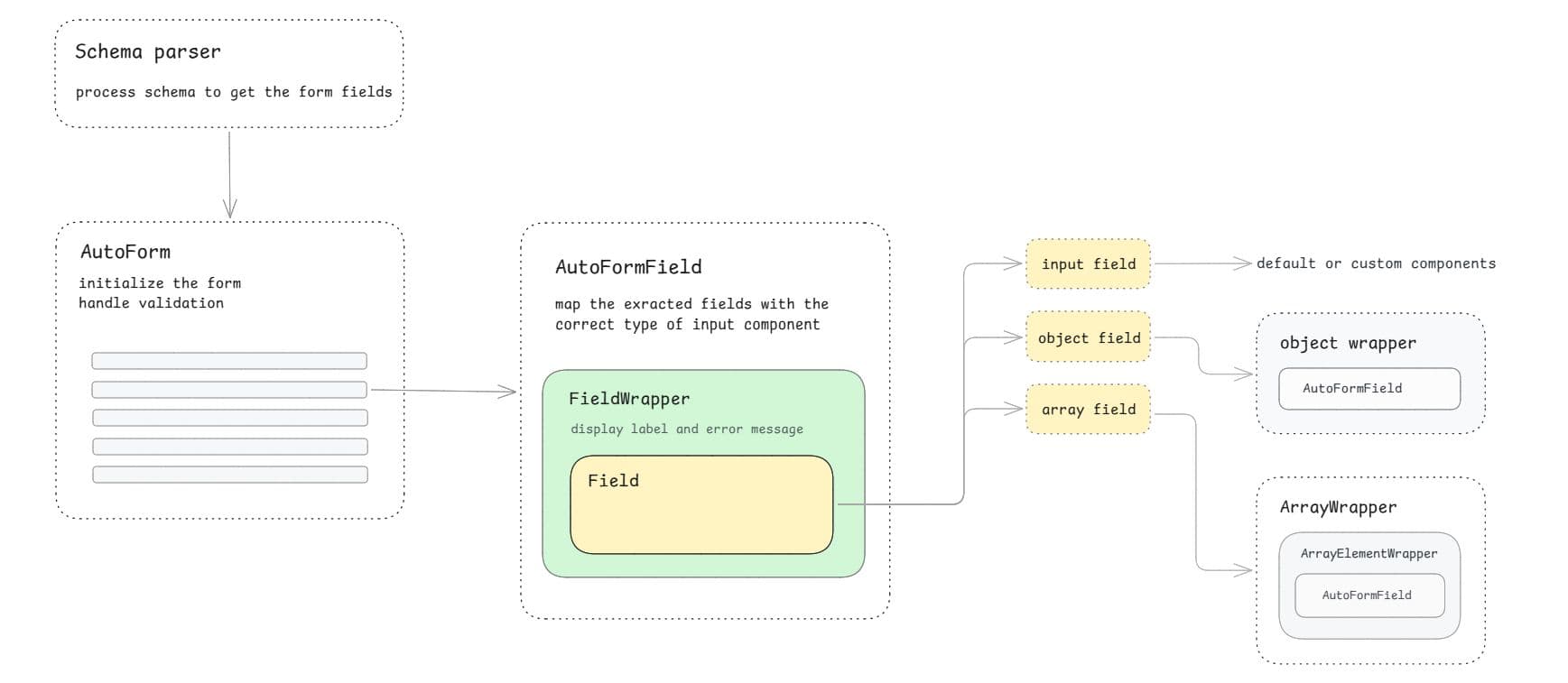
Use this diagram to choose the right customization layer
Field config
fieldConfig helps you customize individual form fields. Use it to set labels, descriptions, input props, field ordering, field-type overrides, and per-field wrappers. See the fieldConfig API for available props.
Import fieldConfig from your schema package: @autoform/zod, @autoform/yup, or @autoform/joi.
In the examples below, we use Zod.
import * as z from "zod";
import { fieldConfig } from "@autoform/zod";
import type { FieldTypes } from "@autoform/mui/tanstack-form";

const schema = z.object({
  username: z.string().check(
    fieldConfig({
      label: "Username",
      description: "Choose a unique username.",
      inputProps: {
        placeholder: "Enter your username",
      },
    }),
  ),

  password: z.string().check(
    fieldConfig({
      inputProps: {
        type: "password",
        placeholder: "Enter your password",
      },
    }),
  ),
});
Input props
Use inputProps to pass props to the resolved field component.
const schema = z.object({
  username: z.string().check(
    fieldConfig({
      inputProps: {
        type: "text",
        placeholder: "Username",
      },
    }),
  ),
});
// This will be rendered as:
<input type="text" placeholder="Username" /* ... */ />;
Description
Use description to add helper content below the field. You can use JSX in the description.
const schema = z.object({
  username: z.string().check(
    fieldConfig({
      description:
        "Enter a unique username. This will be shown to other users.",
    }),
  ),
});
Order
Use order to change field ordering. Smaller numbers render first. Fields without an order use 0.
const schema = z.object({
  termsOfService: z.boolean().check(
    fieldConfig({
      order: 1,
    }),
  ),
  username: z.string().check(
    fieldConfig({
      order: -1,
    }),
  ),
});
Custom fields
You can customize fields in two ways
- override UI components such as
FieldWrapper - add new field components through
formComponents.
AutoForm renders every generated field inside the FieldWrapper UI component. The wrapper renders the resolved label, validation error and field component as children, so normal field components should render only the input control.
Overriding default UI components
You can override the default UI components with custom components. This allows you to customize the look and feel, either globally or for specific fields.
FieldWrapper, ObjectWrapper, ArrayWrapper, and ArrayElementWrapper can be overridden globally through uiComponents, or per field through fieldConfig. When both are provided, the wrapper from fieldConfig is used for that field.
Example: Creating custom FieldWrapper
The FieldWrapper is responsible for rendering the field label and error, so when you use a custom wrapper, you need to handle these yourself. You can take a look at the FieldWrapperProps type to see what props are passed.
// CustomFieldWrapper.tsx
import type { FieldWrapperProps } from "@autoform/react";

export function CustomFieldWrapper({
  children,
  label,
  error,
  id,
}: FieldWrapperProps) {
  return (
    <div>
      <label htmlFor={id}>{label}</label>
      {children}
      {error}
    </div>
  );
}

// App.tsx
import { CustomFieldWrapper } from "./CustomFieldWrapper";

// 1. Globally override the field wrapper for all fields

<AutoForm
  uiComponents={{
    FieldWrapper: CustomFieldWrapper,
  }}
/>;

// 2. Or override it for a specific field in your schema
const schema = z.object({
  email: z.string().check(
    fieldConfig({
      fieldWrapper: CustomFieldWrapper,
    }),
  ),
});
You can use the same pattern for nested object fields and array fields:
Adding new form components
You can also add your own custom field types. To do this, you need to extend the formComponents prop of your AutoForm component and add your custom field type.
Keep form components focused on wiring the input. Most form components should not render the label or error directly because FieldWrapper already handles that. Still AutoFormFieldProps includes them for advanced UI integrations.
For binding field components, use useFieldContext from @autoform/react/tanstack-form.
// CustomInput.tsx
import type { AutoFormFieldProps } from "@autoform/react";
import { useFieldContext } from "@autoform/react/tanstack-form";

export function CustomInput({ id, inputProps }: AutoFormFieldProps) {
  const field = useFieldContext<string>();

  return (
    <input
      id={id}
      type="text"
      name={field.name}
      value={field.state.value ?? ""}
      onBlur={field.handleBlur}
      onChange={(event) => field.handleChange(event.target.value)}
      {...inputProps}
    />
  );
}

// App.tsx
import { CustomInput } from "./CustomInput";

<AutoForm
  formComponents={{
    custom: CustomInput,
  }}
/>;

// By default, AutoForm uses the Zod type to determine the input component to use.
// You can override this by using the fieldType property.
const schema = z.object({
  username: z.string().check(
    fieldConfig<React.ReactNode, FieldTypes | "custom">({
      fieldType: "custom",
    }),
  ),
});
You can also access field-specfic states etc.
import type { AutoFormFieldProps } from "@autoform/react";
import { useFieldContext } from "@autoform/react/tanstack-form";

export function CustomCheckbox({ id, inputProps }: AutoFormFieldProps) {
  const field = useFieldContext<boolean>();
  const { isTouched, isDirty } = field.state.meta;

  return (
    <div>
      <input
        id={id}
        name={field.name}
        type="checkbox"
        checked={!!field.state.value}
        onBlur={field.handleBlur}
        onChange={(event) => field.handleChange(event.target.checked)}
        {...inputProps}
      />
      {isTouched && " (Touched)"}
      {isDirty && " (Modified)"}
    </div>
  );
}
If the component needs another field's value, get the form with useFormContext and subscribe to the smallest value you need with form.Subscribe.
For more examples on creating custom form components see examples.
For UI-library implementations, see the official field components: Shadcn fields, MUI fields, Mantine fields and Ant fields.
Form element customization
Pass props to the underlying form element with formProps.
<AutoForm
  schema={schemaProvider}
  onSubmit={handleSubmit}
  formProps={{
    className: "my-custom-form space-y-4",
    "data-testid": "user-form",
    noValidate: true,
    onKeyDown: (e) => {
      if (e.key === "Enter") e.preventDefault();
    },
  }}
/>
Submit Button
1. Submit button inside AutoForm
The simplest way is to use the withSubmit prop which adds a default submit button:
<AutoForm schema={schemaProvider} onSubmit={handleSubmit} withSubmit />Render a custom submit button as a child when you need custom markup:
<AutoForm schema={schemaProvider} onSubmit={handleSubmit}>
  <button type="submit">Create Account</button>
</AutoForm>
External submit button, using HTML form attribute
<AutoForm
  schema={schemaProvider}
  onSubmit={handleSubmit}
  formProps={{ id: "my-form" }}
/>
<button type="submit" form="my-form">
  Submit
</button>;
2. Submit and reset buttons outside AutoForm
For components outside AutoForm, create a TanStack form with useAppForm, pass it to formControl, and call methods on that form instance. Use it to access form data, state, and methods from outside AutoForm.
import * as React from "react";
import { formOptions } from "@tanstack/react-form";
import { useAppForm } from "@autoform/react/tanstack-form";

// Keep formOptions stable.
// Memoize dynamic options or define static ones outside.
// Avoid setting initial default values inside `formOptions`. Pass them to `AutoForm` using the `defaultValues` prop instead.
// const options = formOptions();

export default function MyForm() {
  const options = React.useMemo(() => formOptions({}), []);
  const form = useAppForm(options);

  return (
    <div>
      <AutoForm
        formControl={form}
        schema={schemaProvider}
        defaultValues={{ username: "" }}
      />

      <button type="button" onClick={() => form.handleSubmit()}>
        Submit
      </button>
      <button type="button" onClick={() => form.reset()}>
        Reset
      </button>
    </div>
  );
}
When options depend on props or local values, memoize them with useMemo before passing them to useAppForm, or define them at module scope when they are static.
Custom Validator & Value Cleanup
AutoForm automatically replaces empty values such as "" and null with undefined before every validation. This ensures optional schema fields behave exactly as expected without triggering validation errors for empty inputs.
Set removeEmptyValue to false inside formProps to disable this cleanup behaviour.
<AutoForm
  schema={schemaProvider}
  formProps={{ removeEmptyValue: false }}
  onSubmit={(data, form) => {
    console.log(data); // Schema-parsed values
    console.log(form.state.values); // Original raw TanStack values
  }}
/>Custom Validator: To replace AutoForm's default validator, create an external form with useAppForm from "@autoform/react/tanstack-form". Add your own validator and pass it to formControl:
// The custom validator receives the original form values.
// It replaces AutoForm's default validator.

import { formOptions, revalidateLogic } from "@tanstack/react-form";
import { AutoForm, useAppForm } from "@autoform/react/tanstack-form";
import { customValidator, schemaProvider } from "@/lib/schema";
import * as React from "react";

// Keep formOptions stable
// memoize dynamic options or define static ones outside.
// const options = formOptions();

export default function MyForm() {
  const options = React.useMemo(
    () =>
      formOptions({
        validators: {
          onDynamic: customValidator,
        },
        validationLogic: revalidateLogic(),
      }),
    [],
  );
  const form = useAppForm(options);

  return <AutoForm formControl={form} schema={schemaProvider} />;
}
The defaultValues and onSubmit passed as props to Autoform are not overriden by the external formControl.
Customizing the React package
In some cases, you may need customization that isn't supported by the package API. You can install the TanStack Form adapter code directly into your project to modify it.
npx shadcn@latest add https://raw.githubusercontent.com/vantezzen/autoform/refs/heads/main/packages/shadcn/registry/autoform-react-source-tanstack.jsonpnpm dlx shadcn@latest add https://raw.githubusercontent.com/vantezzen/autoform/refs/heads/main/packages/shadcn/registry/autoform-react-source-tanstack.jsonyarn shadcn@latest add https://raw.githubusercontent.com/vantezzen/autoform/refs/heads/main/packages/shadcn/registry/autoform-react-source-tanstack.jsonbunx --bun shadcn@latest add https://raw.githubusercontent.com/vantezzen/autoform/refs/heads/main/packages/shadcn/registry/autoform-react-source-tanstack.jsonThe adapter files will be added to lib/autoform/react/. You can change them as needed.